
A logo redesign for CYN Cosmetics, completed in August 2024 and shown with the client’s permission. See all our work.
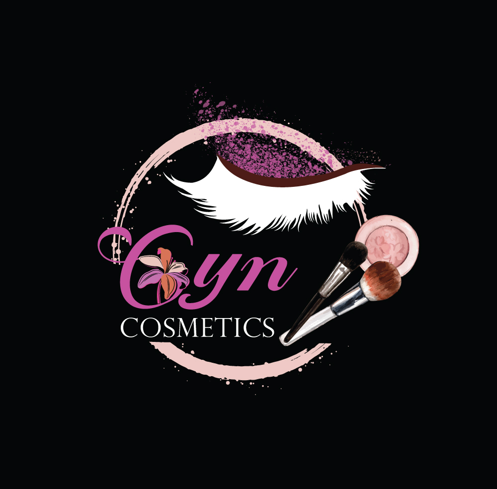
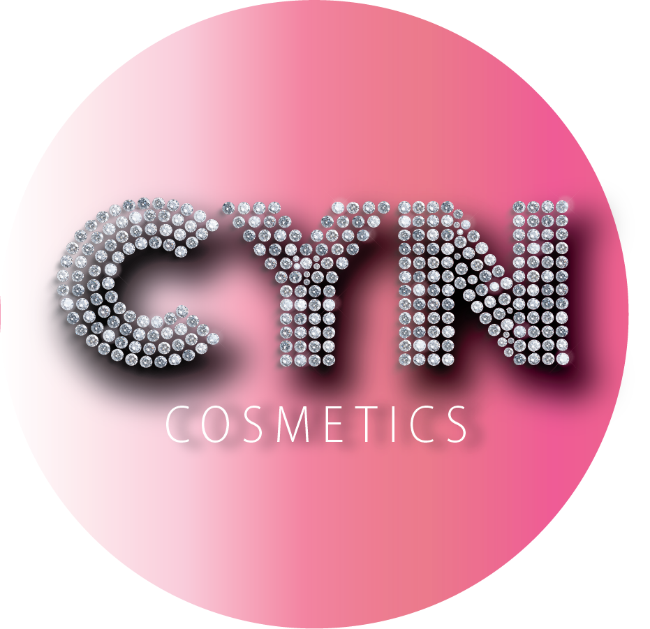
Both logos are shown exactly as provided, without cropping or recoloring. The original said everything at once; the redesign says one thing clearly: the name.
The original logo tried to say everything at once: a magenta script Cyn with a lily in the C, a white eyelash with glitter, a brush-stroke ring, watercolor makeup brushes, a compact and serif COSMETICS type. There was no focal point, and the name was the hardest part to read, especially at small sizes and in a circle crop. Watercolor, glitter and fine strokes also don’t hold up in one color, foil, embroidery or small packaging.
We stripped the mark back to one bold idea: the name. CYN is now a solid, geometric wordmark built from diamonds and rhinestones, with a thin, wide-tracked COSMETICS underneath. A soft white-to-pink circle keeps the brand in its existing pink family and gives the mark a clean shape for avatars.
Nothing. This project was a logo redesign.
The name reads first, even as an avatar or favicon. There is one focal point instead of many. The bold geometry and single diamond texture reproduce cleanly on packaging, social, signage and merch from the same artwork, without a redraw.